PhotoRobot Viewer Layouts & Configs - User Support Manual
This PhotoRobot User Support Manual provides instructions on how to configure PhotoRobot Viewer Layouts and Configurations.
PhotoRobot Viewer Layouts and Configs
In PhotoRobot Controls App (further referred to as “CAPP”), PhotoRobot Viewer is a 2D + 3D + 360 product viewer. It enables users to configure product viewer layouts and to customize settings for the distribution of product content online.
There are currently two different viewer layout types, one with buttons and one with thumbnails. Configuration options then function for still image folders and for spin image folders. These enable users to configure the product viewing experience, and to customize image settings in many ways. This includes annotated hot spots, image behavior, display options, image settings, and more.
Note: The following instructions describe how to initially create layouts in PhotoRobot Viewer, and define its appearance for the output of any Wizard. For technical instructions on how to configure Wizards, see the PhotoRobot Wizard Mode Support Manual.
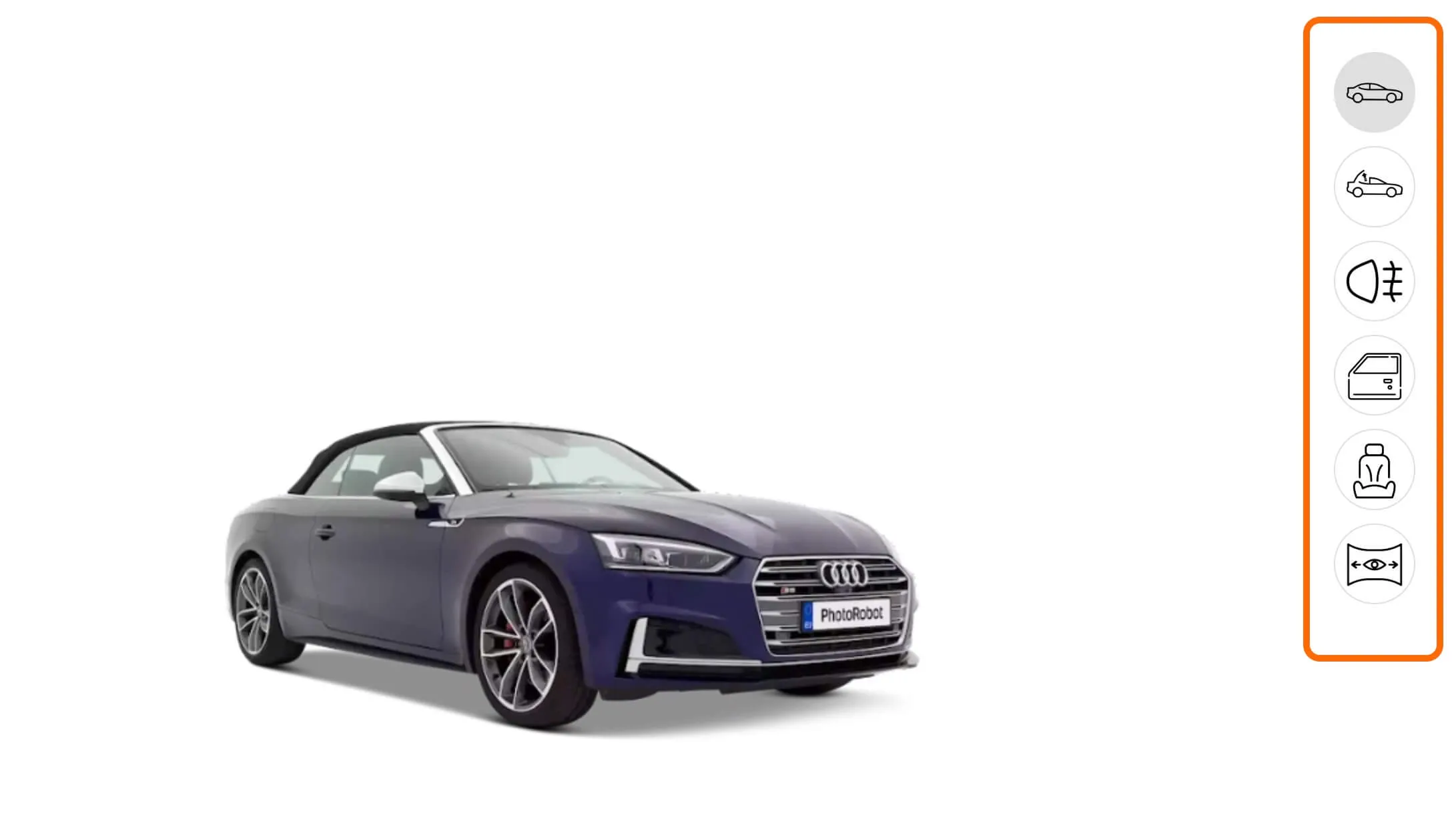
Viewer Layouts - Overview
In CAPP, it is possible to create a viewer layout and define its appearance for the output of any PhotoRobot Wizard. To do this, the icons of the layout correspond to the folders of the outputs in the software:
Buttons - Viewer Layouts
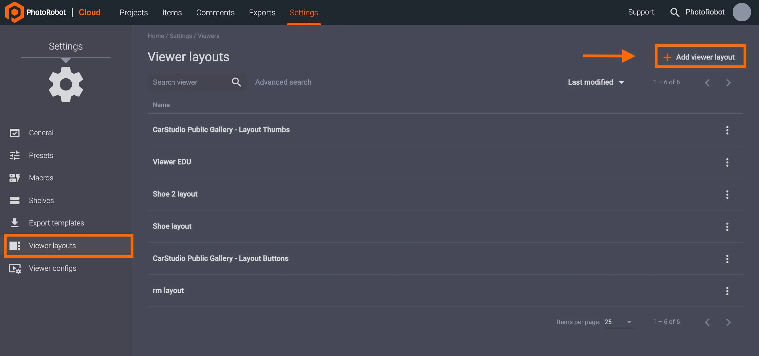
To access PhotoRobot Viewer layout settings, it is necessary to open CAPP in the Cloud 2.0 (or higher) version of the software. In the cloud-based app, click Settings in the main user menu, and access Viewer layouts in the options that appear on the left of the user interface.
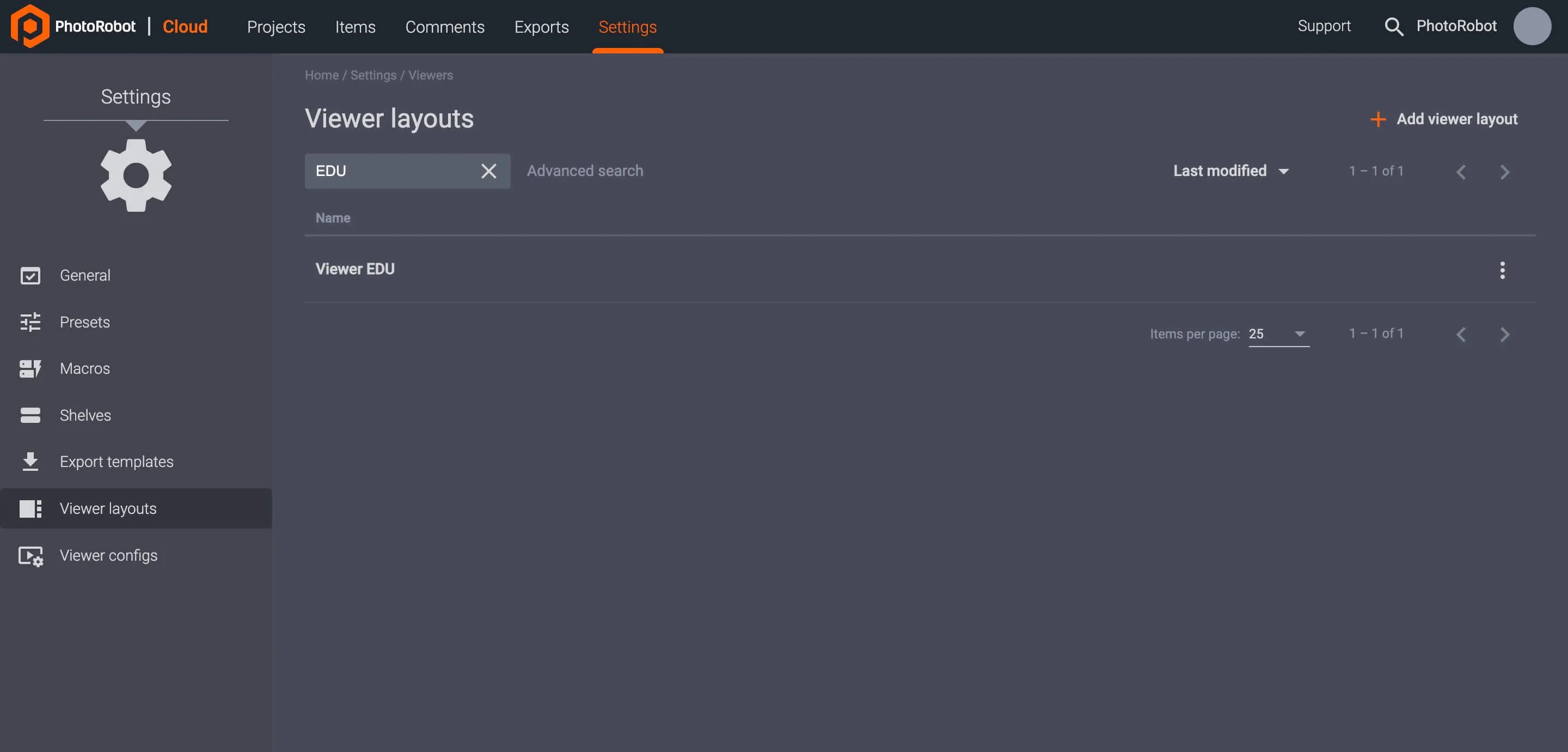
Viewer layouts settings enable users to + Add viewer layout in the top-right of the menu, and to configure existing viewer layouts if available.
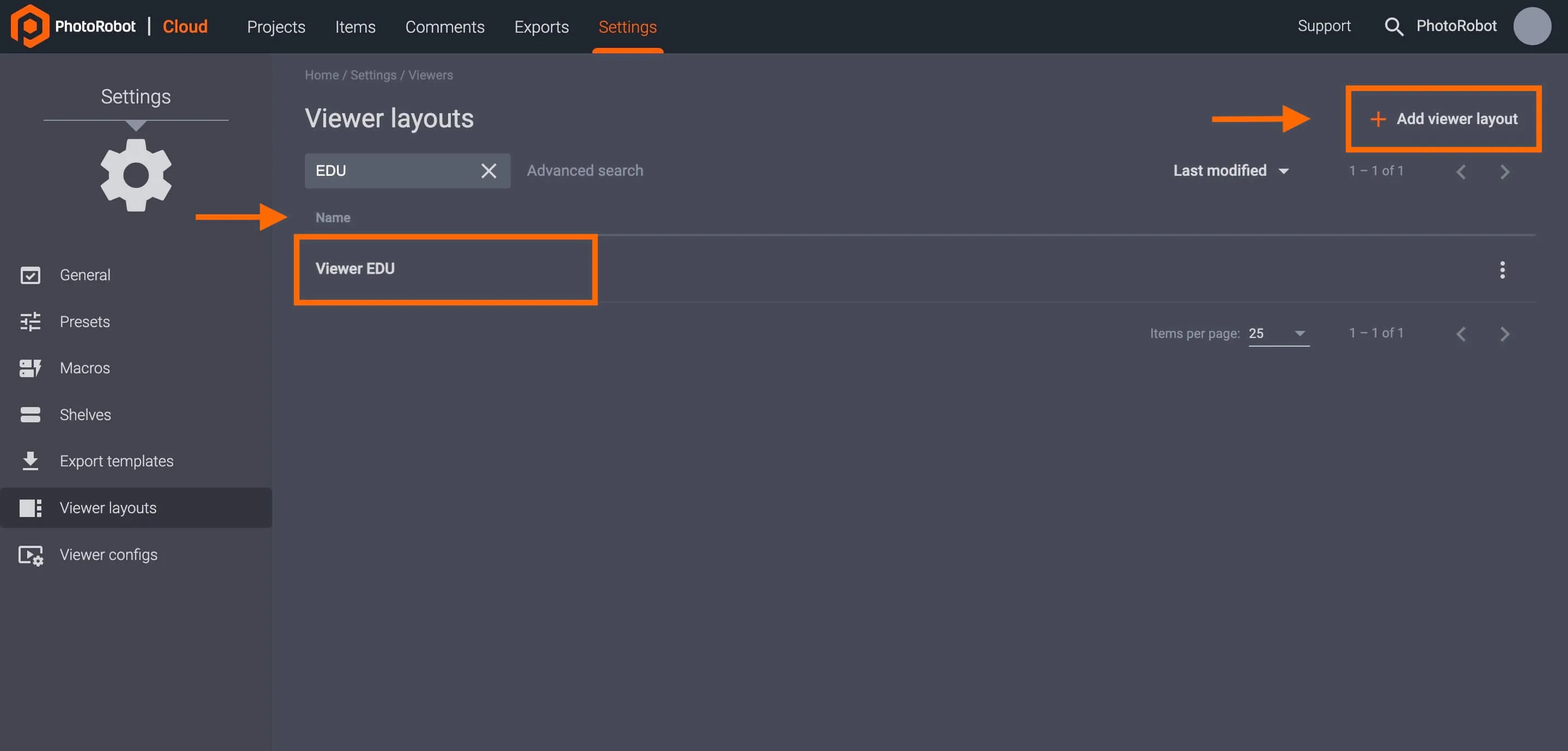
When adding or configuring a viewer layout, settings then allow for two types of viewer layouts: Buttons or Thumbnails.
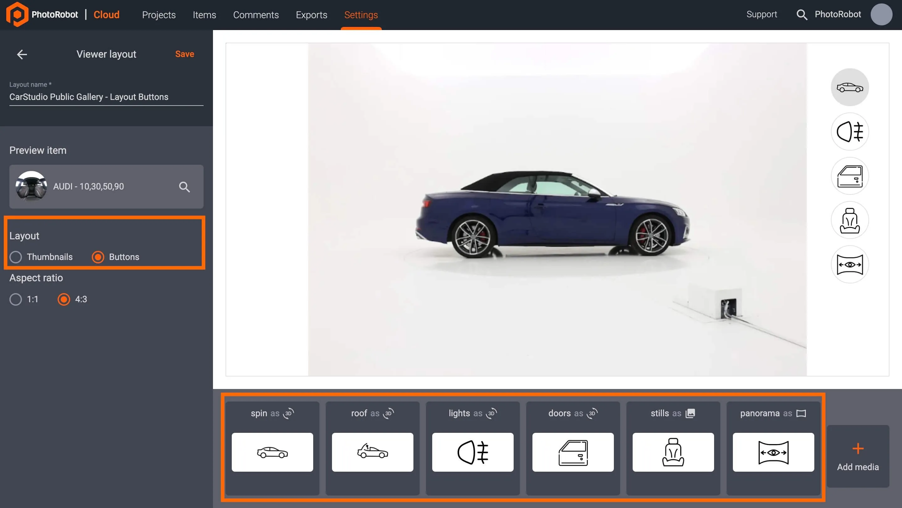
Select Buttons to define an icon for each folder at the bottom of the user interface. Here, it is possible to edit the icon and label of existing buttons, or to create new buttons at the bottom of the user interface by clicking + Add media.
Thumbnails - Viewer Layouts
The second viewer layouts setting is with thumbnails. Access this option when configuring any existing viewer layout or adding a new viewer layout.
Toggle Thumbnails on in the viewer layouts menu options on the left of the interface to display images in a product gallery view.
Create Viewer Layout
To create a new viewer layout, open Settings and then Viewer layouts in the Cloud 2.0 (or higher) version of CAPP. Then, use the button + Add viewer layout in the top-right of the settings menu:
Create Viewer Layout Settings
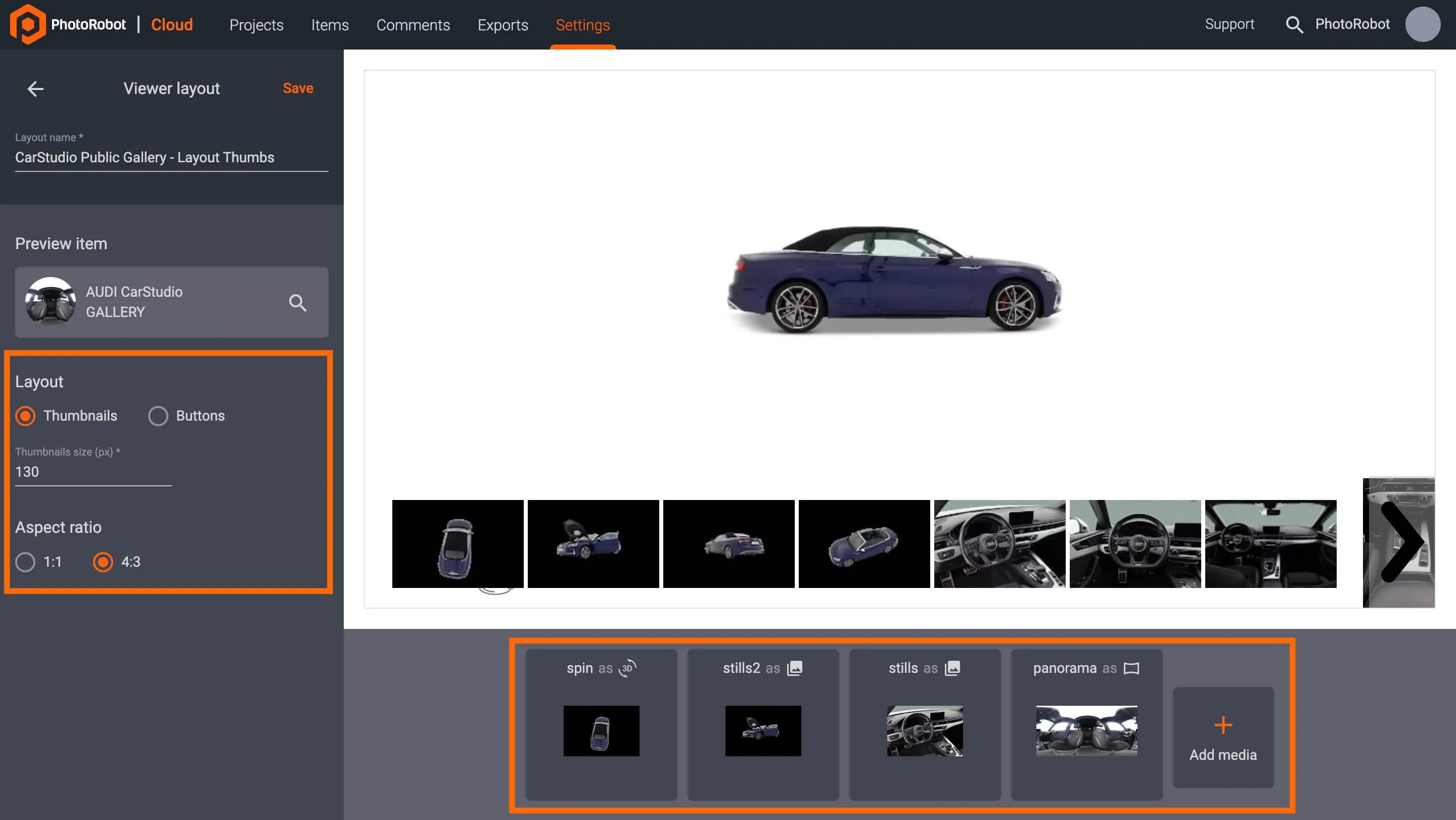
Configure a new viewer layout settings by the following options.
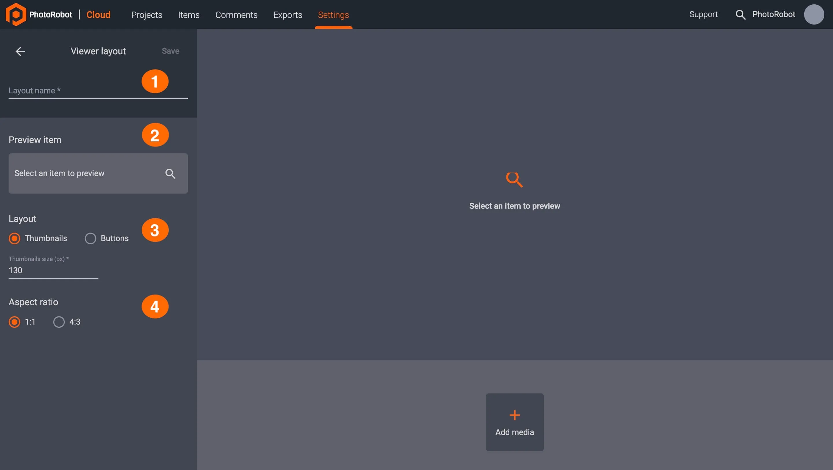
- Layout name: Fill in to create the name of the new layout.
- Preview item: Click to select an item from all items or using advanced search.
- Layout type: Select Thumbnail or Button viewer layout.
- Aspect ratio: Choose aspect ratio 1:1 or 4:3.
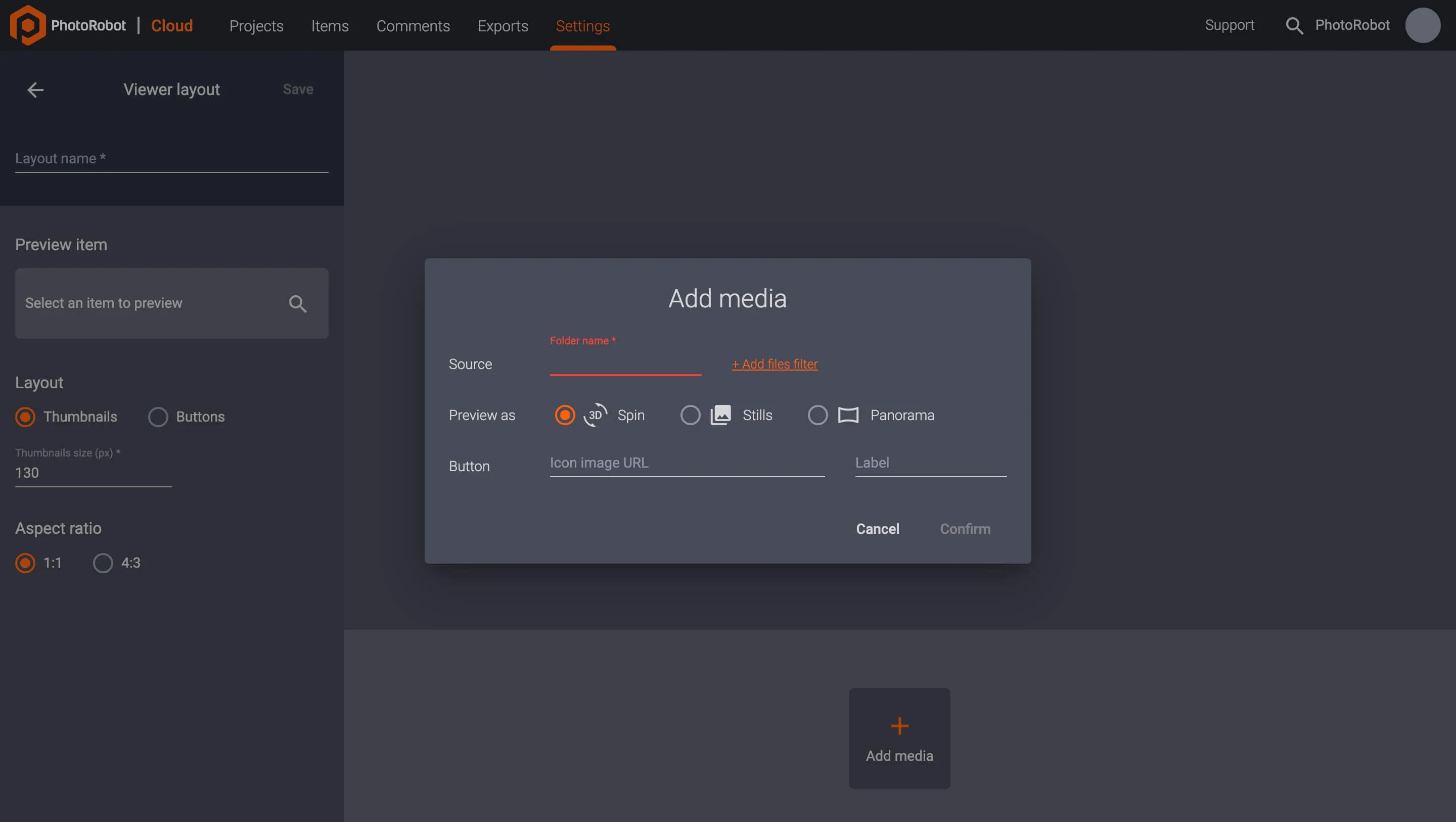
Add Media to New Viewer Layouts
To upload new media to a viewer layout, use the button + Add media at the bottom of the viewer layout settings user interface. Add media options enable users to upload media to a specific folder, define how to preview the media, and configure button options.
Viewer Configurations
In the Cloud-based version of CAPP, it is also possible to customize viewer settings by item, project, or organization.
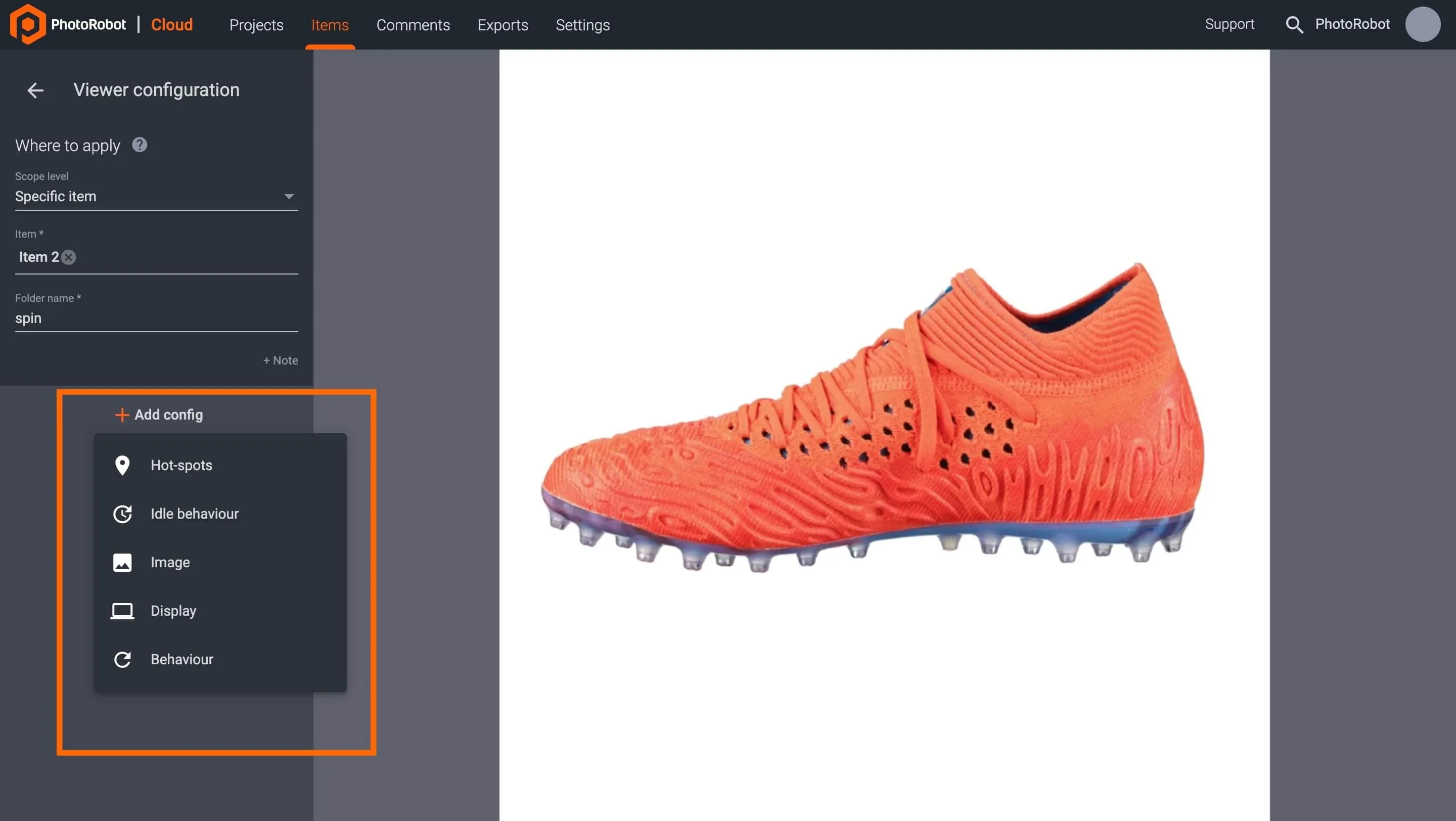
To customize viewer settings by item, open the item in the Cloud, and select Viewer to access configurations for the item’s folders. Next, select a folder (e.g. ‘spin’ or ‘stills’), and click the edit icon or the three vertical dots to the right of the folder, and Edit to customize the folder.

Inside the viewer config options, the button + Add Config enables users to further customize the folder’s output. Viewer layout options for a spin folder include:
- Hot spots
- Idle behavior
- Image
- Display
- Behavior
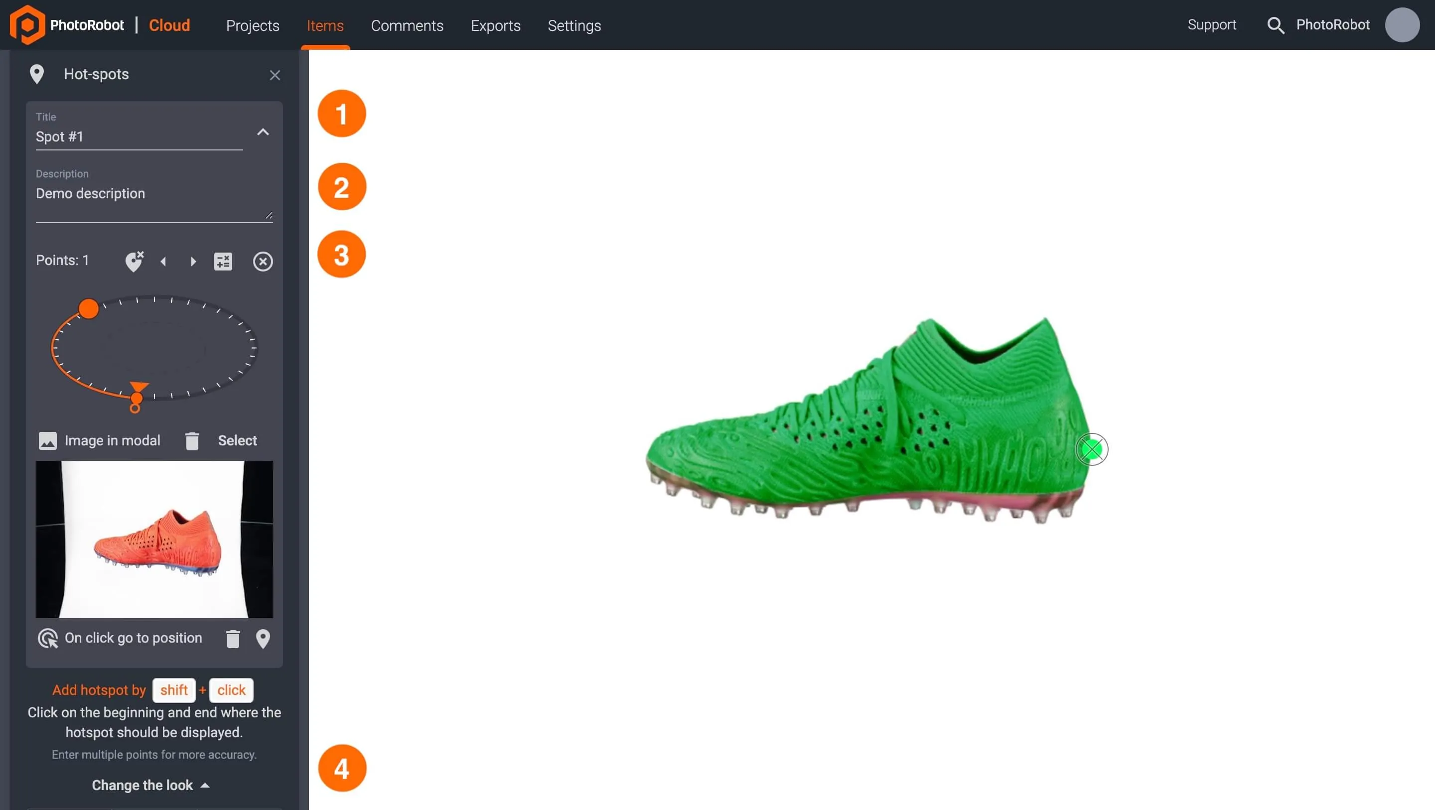
Hot Spots
In the viewer settings of a spin folder, configure hot spots via the button + Add config followed by Hot-spots. Then, add a hot spot using Shift + Click, clicking first on the beginning and next on the ending of where the hotspot should display.
There are then four options to customize hot spots:
- Title: Customize the title text which appears on the hot spot.
- Description: Use to add additional information below the hot spot title.
- Points: Set the range of visibility for the hot spot.
- Change the look: Click to customize Color, Size, Opacity, Pulse.

Idle Behavior
To configure the idle behavior settings of a spin folder, open its Viewer settings in the Cloud, and use + Add config followed by Idle behavior.
Idle behavior settings enable users to specify:
- Rotate: How many times the image should rotate after loading
- Direction: The direction of image rotation
- Stop: When the rotation should stop (on click, on hover, never)
- Spin after idle: When the rotation will restart again after idle times
- Speed (°/s): The number of degrees the spin rotates per second
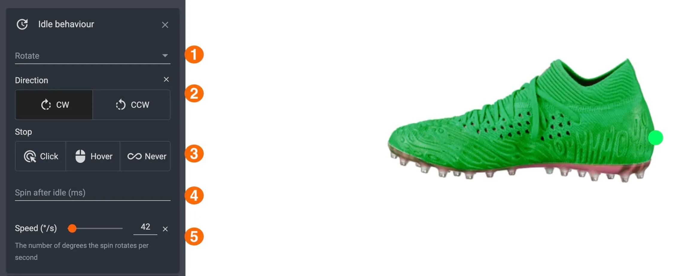
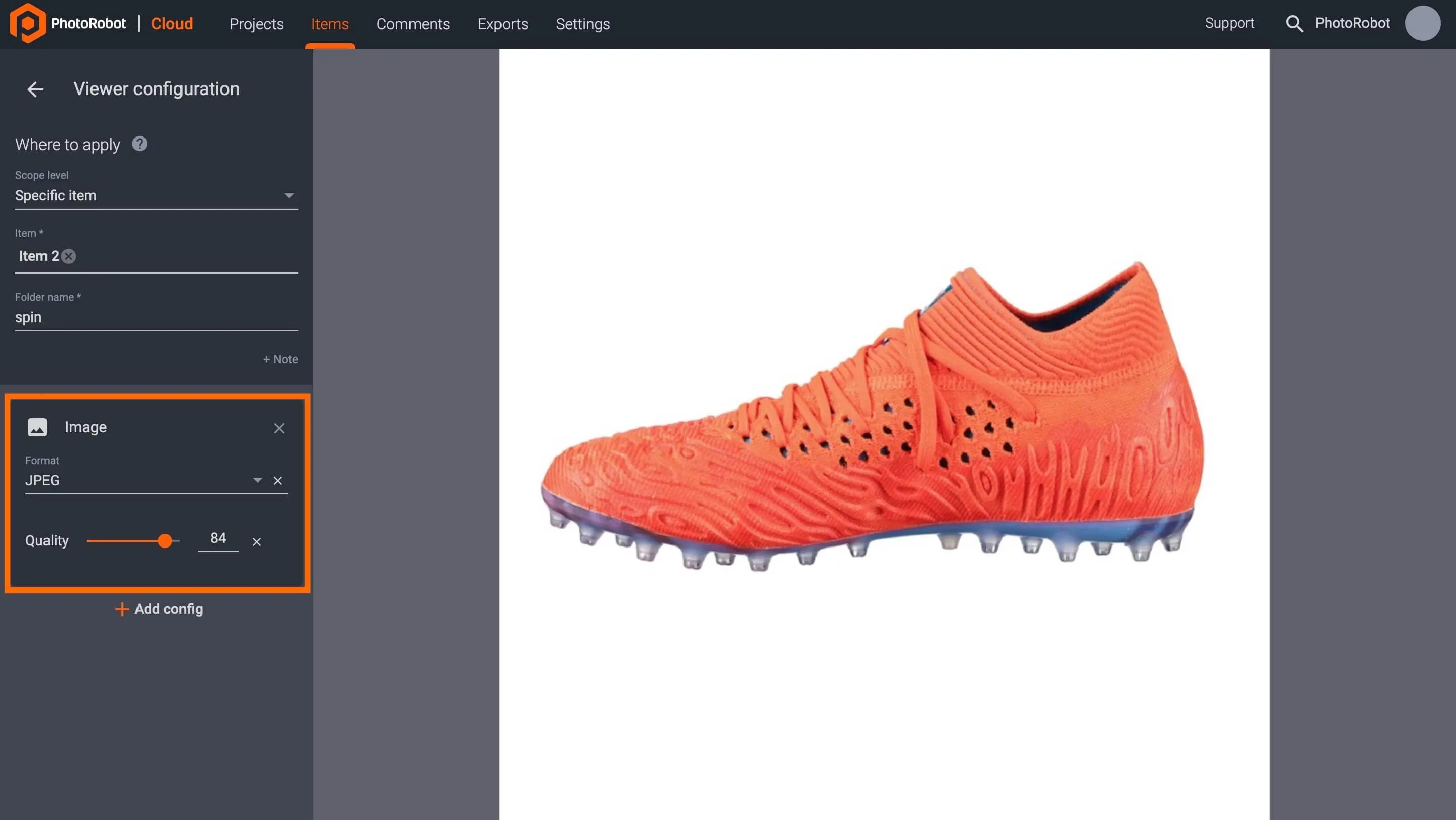
Image Settings
To configure image settings of an item’s folder (‘spin’ or ‘stills’), navigate to its Viewer settings in the Cloud, and use + Add config followed by Image.
Image settings enable users to specify the image format and quality of the image viewer:
- Format: Select file format in JPEG, WEBP, or PNG.
- Quality: Adjust by slider or by numerical input.
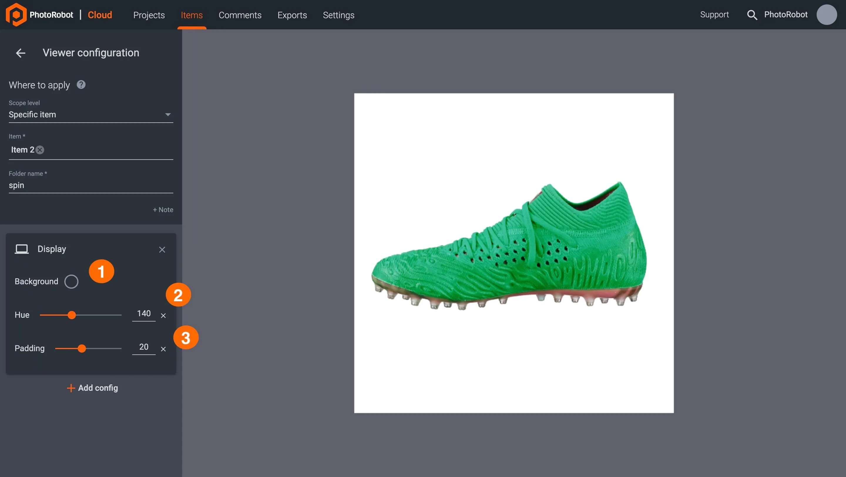
Display Options
To configure the display settings of an item’s folder (‘spin’ or ‘stills’), open Viewer settings in the Cloud, and select the folder to edit. Then, click + Add config followed by Display.
Display settings enable users to change three different areas of how the spin will appear:
- Background: Click to configure the background color of a spin or still image.
- Hue: Adjust the hue of an item in a spin or still image by slider numerical input.
- Padding: Adjust the amount of padding of a spin or still image by slider or numerical input.
Behavior Options
Adjust the behavior of an item’s spin folder by accessing its Viewer settings in the Cloud, and clicking + Add config followed by Behavior.
Behavior configurations enable users to specify three elements of a spin.
- Viewer loading option: Configure rotation on load, hover, or click.
- Start position: Define the start position of the image rotation.
- Full-screen on: Configure full-screen viewing by click, hover, or disabled.


EOS Rebel Series


EOS DSLR Series


EOS M Mirrorless Series


PowerShot Series


Close-Up / Handheld

The Canon EOS Rebel Series offers beginner-friendly DSLR cameras with solid image quality, intuitive controls, and versatile features. Ideal for photography enthusiasts, these cameras provide reliable autofocus, vari-angle touchscreens, and Full HD or 4K video recording.
Connection
Resolution (MP)
Resolution
The Canon EOS DSLR Series delivers high-quality images, fast autofocus, and versatility, making it ideal for both photography and video production.
Connection
Resolution (MP)
Resolution
The Canon EOS M Mirrorless Series combines compact design with DSLR-like performance. Featuring interchangeable lenses, fast autofocus, and high-quality image sensors, these cameras are great for travelers and content creators seeking portability without sacrificing image quality.
Connection
Resolution (MP)
Resolution
The Canon PowerShot Series offers compact, user-friendly cameras for casual shooters and enthusiasts. With models ranging from simple point-and-shoots to advanced zoom cameras, they provide convenience, solid image quality, and features like image stabilization and 4K video.
Connection
Resolution (MP)
Resolution
The Canon Close-Up & Handheld Cameras are designed for detailed, up-close photography and video. Compact and easy to use, they offer precision focus, high-resolution imaging, and versatile macro capabilities—perfect for vlogging, product photography, and creative close-ups.


